Emine Canlı Beauty Centre
For a life and beauty centre in Sahabiye, Kayseri
- 2026
- Live
- Web
- Product, Design, Frontend, Infrastructure
The situation
In this business the decision is made on trust — people choose where to go by seeing the salon and looking at the work. But most salons keep their shop window on Instagram, where posts scroll away and there's no single answer to "what treatments are there, how are sessions planned, where exactly are you". Social media is good for showing; it isn't enough for deciding.
What we built
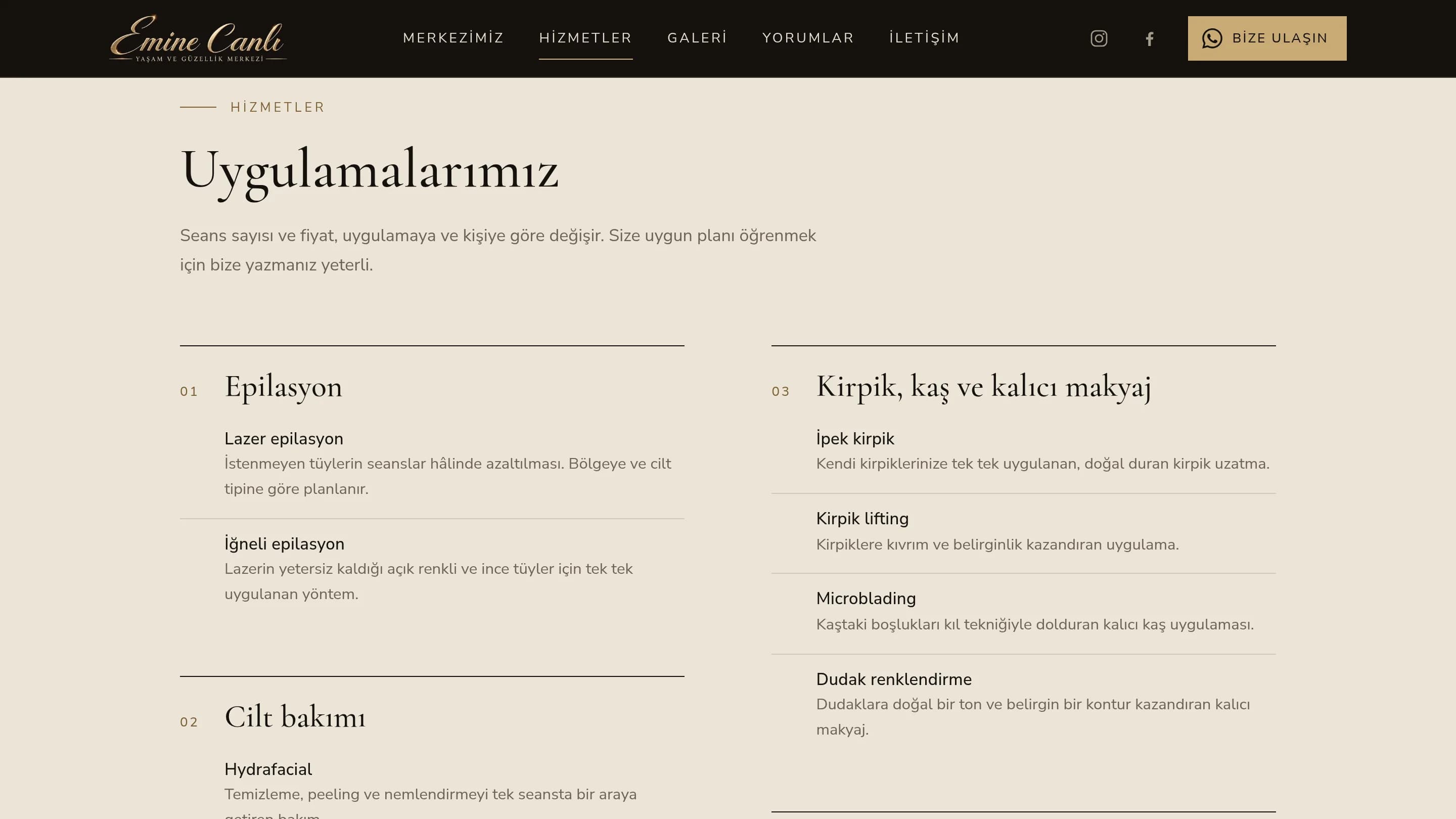
Treatments were grouped under four headings — hair removal, skincare, lashes/brows/permanent makeup, body care — each explained in two sentences. No prices, because the number of sessions varies per person; instead there's a route to "message us to find the plan that suits you". The salon's own photos, opening hours, an address down to the floor and room number, and a single WhatsApp button that stays on every screen. The visitor never reaches the question "so what do I do now".
Approach
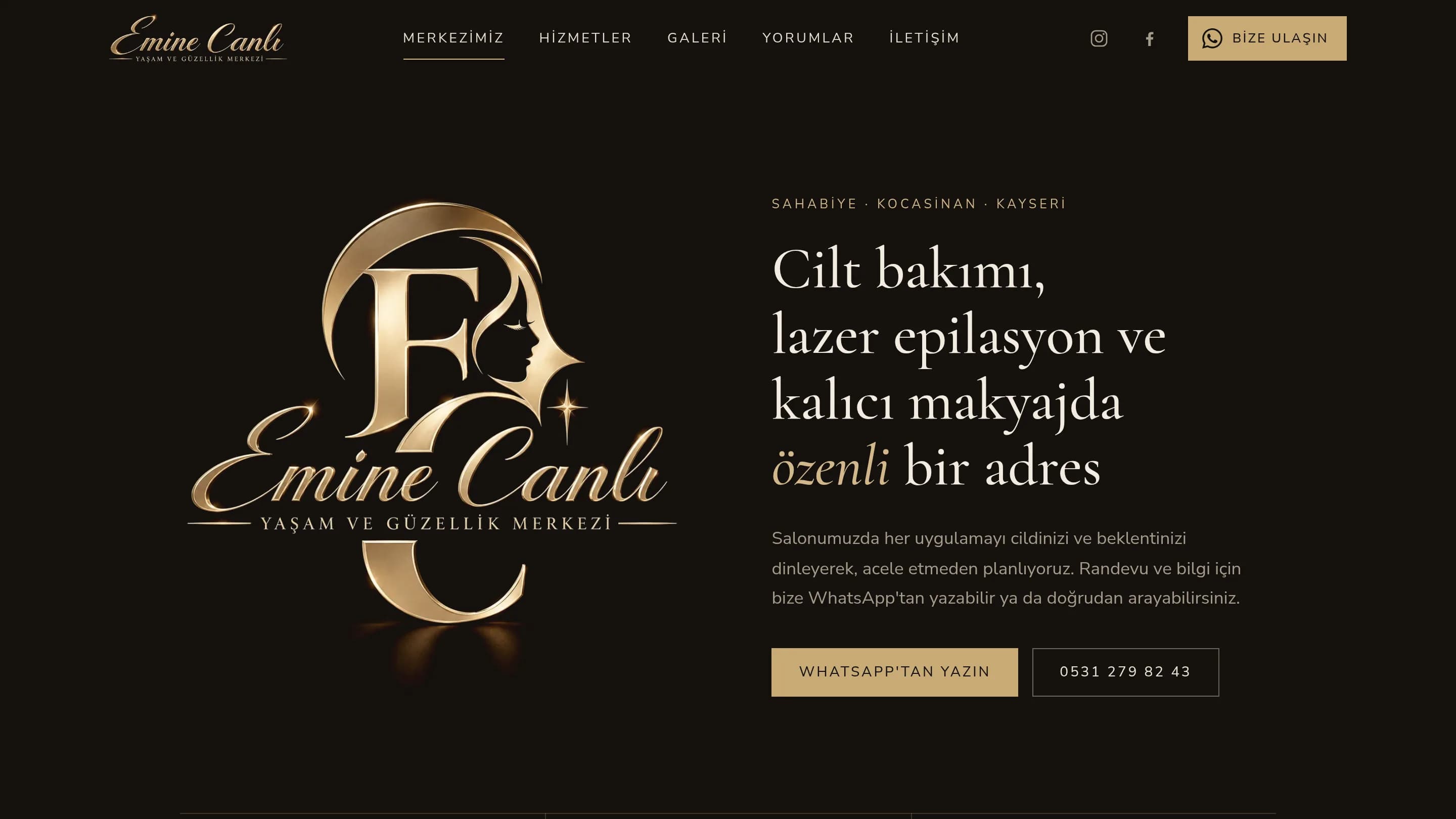
The tone came out of the brand itself: dark ground, brass gold and a serif heading family — the same language as the salon's logo. Written from scratch by hand, no off-the-shelf theme; it opens fast on a phone and needs no ongoing plugin maintenance. The privacy notice was prepared along with the site: for a business that takes appointments, and therefore collects personal data, that isn't an optional extra.
Screens